Chase Budget Redesign
Class Project
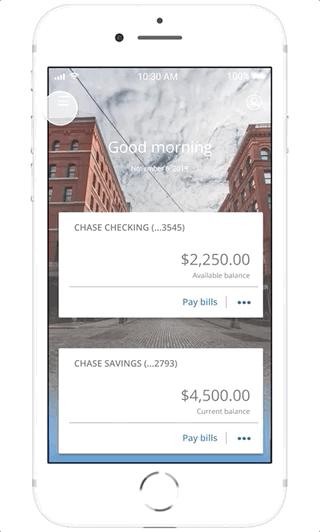
Problem: Chase banking users often used the app to check and pay their balances. When asked about their spending, there was a common theme to spend less despite Chase having financial tools. Thus we thought Chase app users need an easier way to better manage and watch their expenses.
Solution: We decided to create a budgeting feature where users can set and overview monthly spending limits based on certain categories and get notified when they are nearing their limit. As a core feature it promotes existing financial features and gives users more control over their spending.
Outcome: As a class project we completed a Figma prototype and presented it to class. Chase would later include a spending segment in their ‘Daily Snapshot’ summary. Although it implemented categories like we did, the fact that it was only a summary and not interactive still gives merit to our work.
Our Process
Research (Chase app and Competitive Analysis)
Interview (mobile bank students)
Personas
Brainstorm and UX Flow
Create lo-fi (A/B paper prototypes)
User Test (mobile bank students)
Create hi-fi (Figma interactive prototype)
User Test (mobile bank students)
Final Presentation
My Roles
UX Designer
Conducted participant interviews and Chase research
Designed and Simulated Paper Prototype B
Created the Stylesheet in Figma
Conformed the final prototype visuals with Chase mobile layout
Team
Christian Lay-Geng, Jianan Liang, Shivani Talknikar